
For this project I was asked to redesign Aksarben Village's brand. The goal was to take Aksarben Village's current brand identity and expand on it, creating new color pallets, styles, and logos while still maintaining the charm and history of the village.
After researching more about the area, I learned that an old horse racing track used to be there. I expanded upon this and utilized old horse track elements like checkered flags into my designs, as well as bright, complementary colors you would see during horse races.
I made the overall design in an Art Deco style, because Aksarben Village was booming in the 1920's during the Art Deco period. For the logo I implemented this Art Deco theme, taking the 'A' and 'V' from Aksarben Village and stacking them on top of each other while using strong contrast between the thick and thin lines.
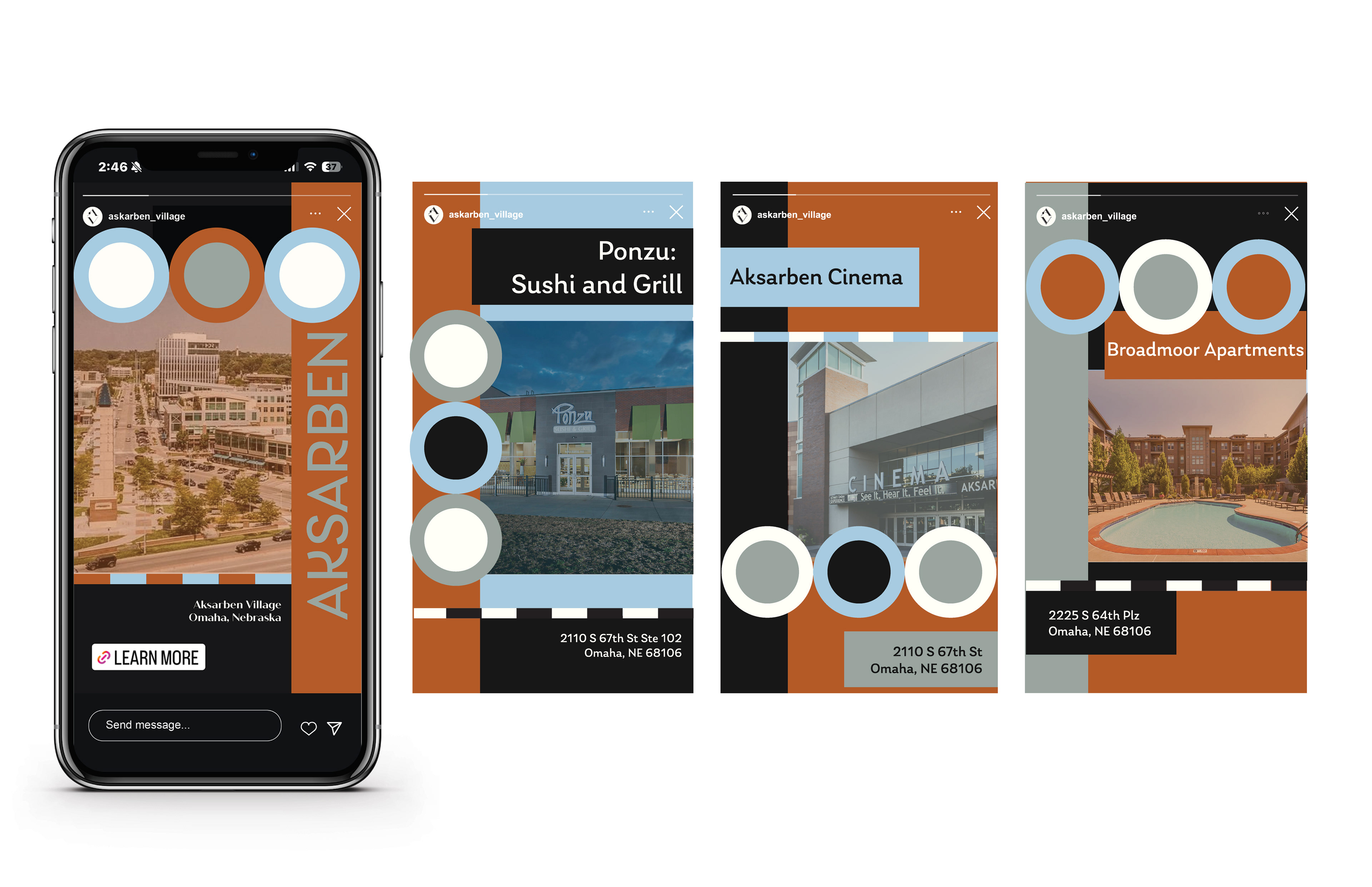
For this social media series I decided to advertise different businesses to promote the food, entertainment, and housing around Aksarben Village. Bringing in the chosen color palette and typography I arranged each piece to showcase an image of the business that is being promoted, along with the name and address.
I also incorporated elements of circles and checkered lines to enhance the horseracing theme, creating a well-rounded and informational social series.
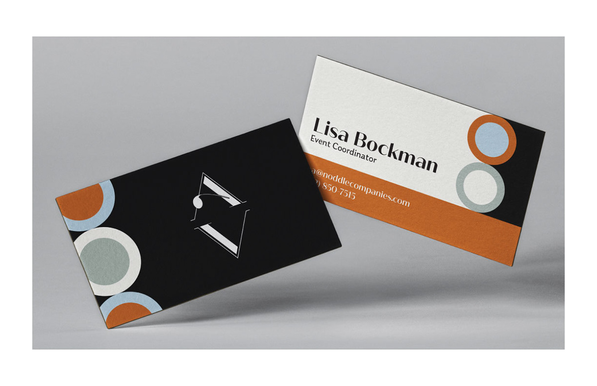
For this business card I incorporated the circle design elements from the social media series while still maintaining a clean, concise look for the information shown. In the Art Deco period it was common to have images on dark backgrounds, so I made the background of the front black to really make the logo pop and give that Art Deco feel, while also placing the circle elements on the left side to create consistency with the front and back. For the back I kept it more minimal so the information is prominent and easy to read.