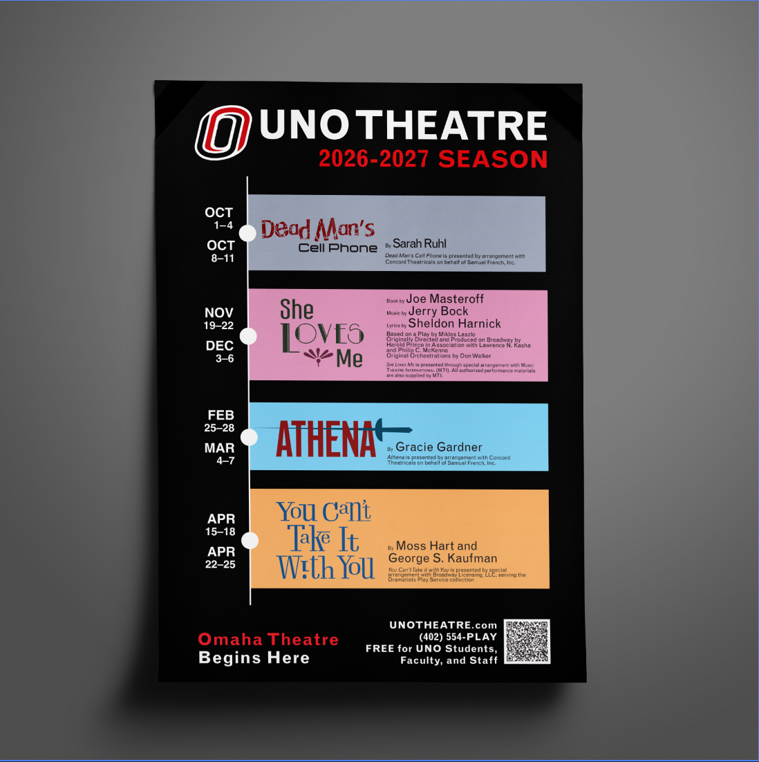
I was given the opportunity to work with the University of Nebraska-Omaha Theatre in designing the seasonal poster for that year. I was tasked with creating the titles of "Dead Man's Cellphone" and "She Loves Me", along with the overall layout and style of the poster. Utilizing UNO's brand guide colors of black, red, and gray, I created a poster in a timeline style to clearly show dates and corresponding plays. I used blocks of vibrant colors to distinguish each play and their playwrights, allowing easy legibility and cohesiveness. The two titles I worked on were inspired by what the play was about. For both I decided to use two colors to bring life and depth to the titles and bring more color to the overall poster. I also used different sizing and typefaces to give a dynamic style to each title.
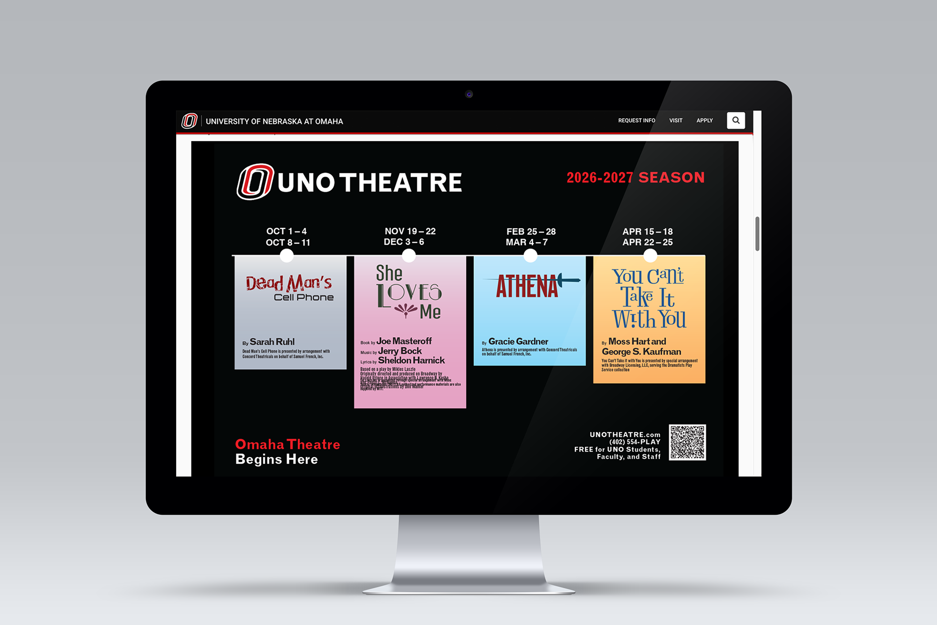
Along with creating the main 2026-2027 seasonal poster, I was also tasked with creating different variations of the poster for different digital mediums. This included variations for TV monitors around the University of Nebraska-Omaha, as well as variations for different digital presences. This is an example of the variation I created for the UNO theatre website, showcasing a version of the poster that is more horizontal with information shown in a vertical orientation, allowing for better legibility as well as utilizing the horizontal space of the computer monitor so that all information is shown without having to scroll down.
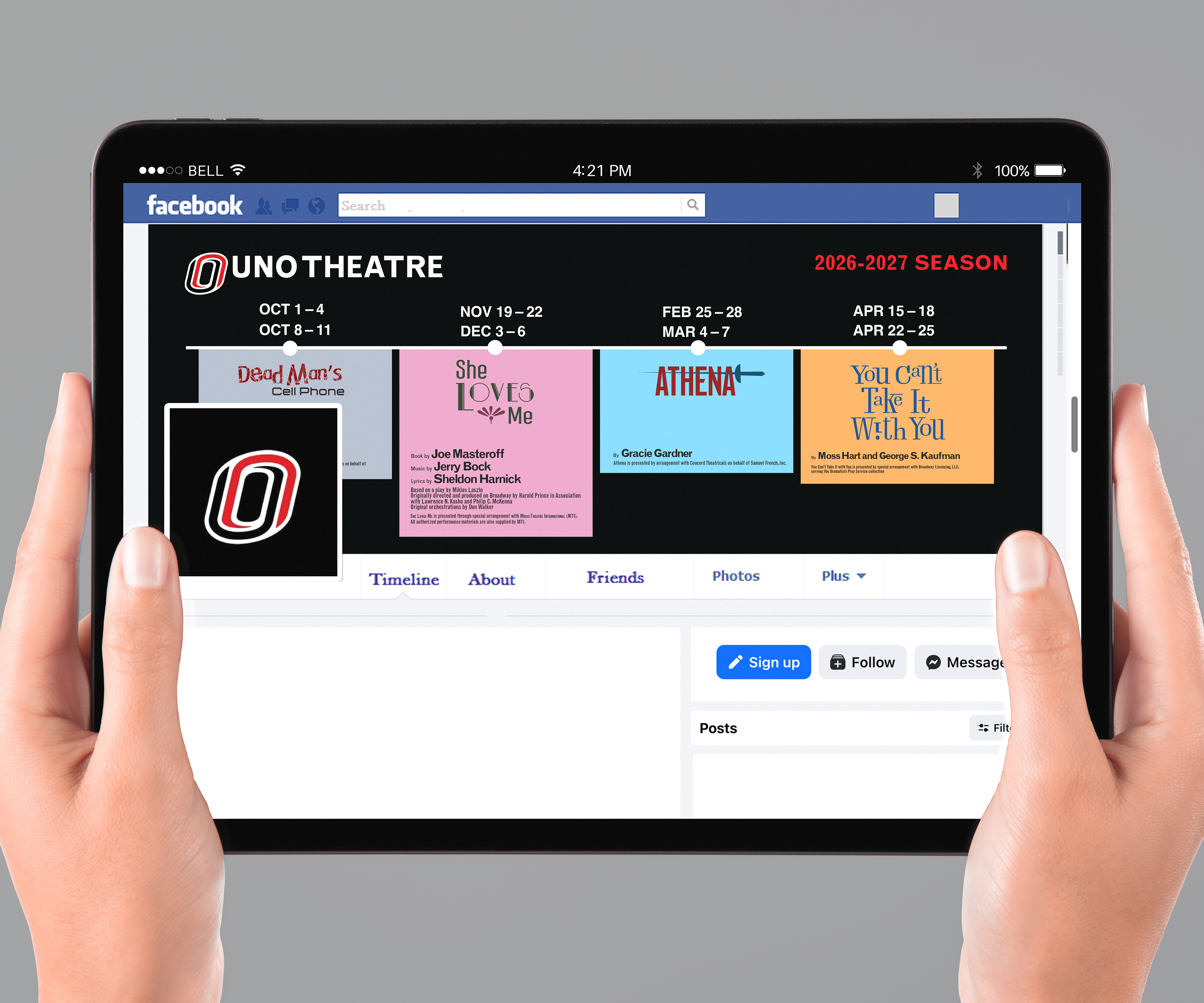
Another variation example I created was for the UNO theatre Facebook page banner. This also utilized a horizontal orientation with vertical information, while creating a simpler and cleaner look from the website version due to the banner being more horizontal and confined.
Along with the seasonal poster, I was also tasked with creating the individual posters for each play, which expanded on each theme of the play as well as provide more information. To the right is the poster for "DeadMan's CellPhone". I was given the photo from UNO Theatre, showcasing a backlit man with a blank face. I edited the photo so the colors were a bit darker but still vibrant, giving the photo a mysterious and eerie feel. The rest of the information is similar to the seasonal poster, with the exception of performance dates and times. The poster overall is simple yet conveys the appropriate information for interested audiences, as well as provided a call-to-action to promote ticket sales.
