This project was created for my Graphic Design II class. The objective was to build a cohesive brand guide based on a chosen brand name and identity. I was assigned an Italian restaurant named "Vita Bella". The brand's identity focused on authentic cuisine presented with a homey, aesthetic feel and a genuine taste of Italy.
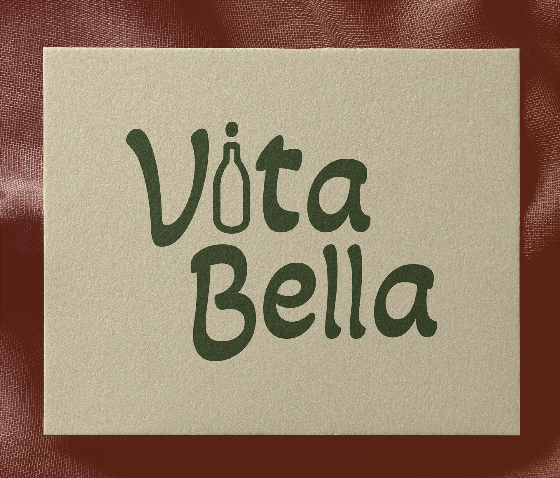
The design process involved creating a logo, color palette, typography system, and supporting visuals that communicate the brand. For the logo I chose a more rounded typeface to emphasize the homey feel of the brand, while incorporating a bottle of wine for the "i" to show the aesthetic cuisine aspect of the restaurant.
I chose earthy tones of green, brown, and cream to really pronounce the warming, genuine feel of the brand.
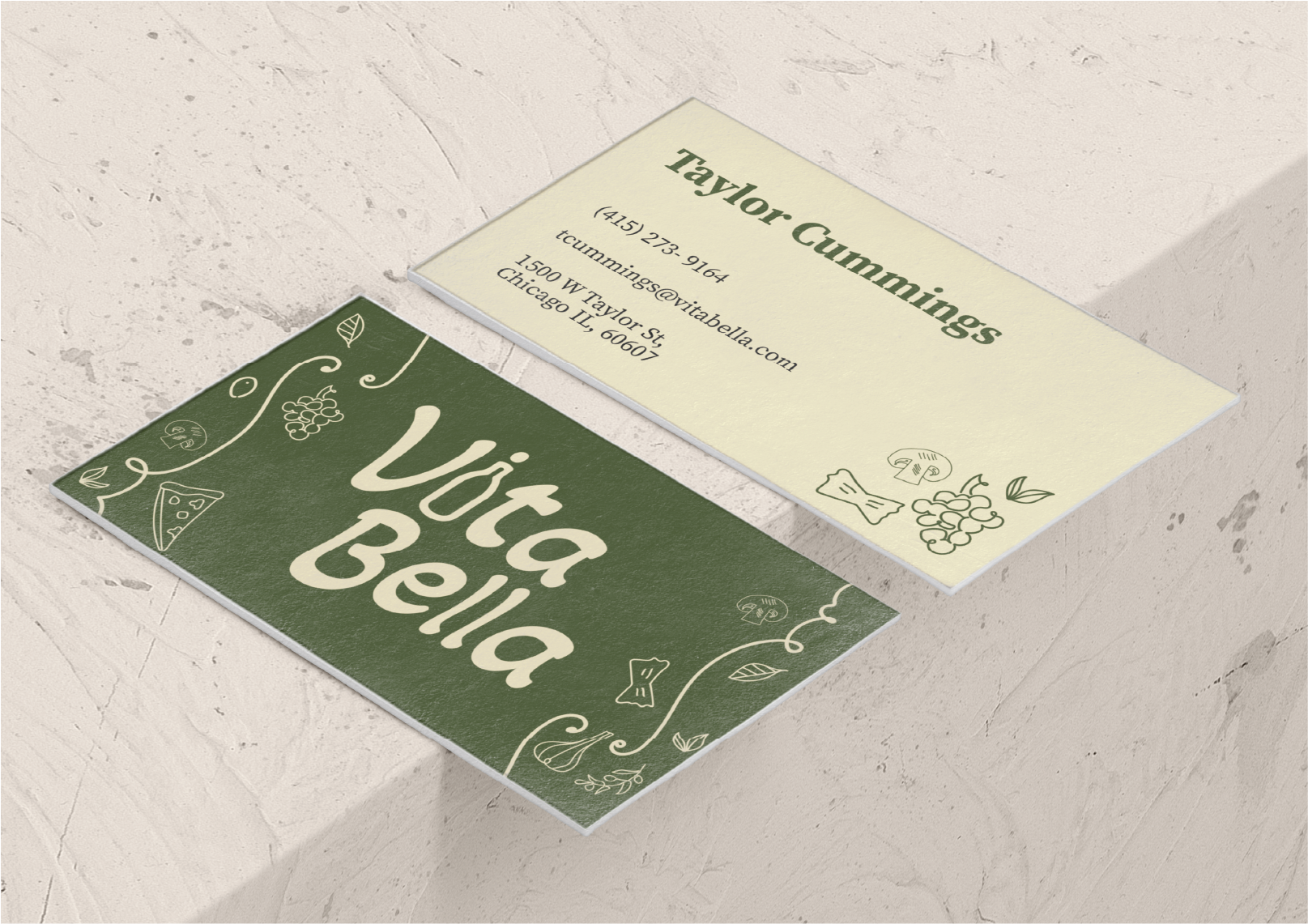
I designed business cards for employees at the Vita Bella restaurant. I incorporated the brand logo along with hand drawn imagery on the front to bring out the homey, Italian feel of the restaurant. I chose a neat serif font for the name and a basic sans-serif font for the information to create an overall clean and legible back to the card. I incorporated both the green and cream brand colors to further create unity in the piece with the brand identity.
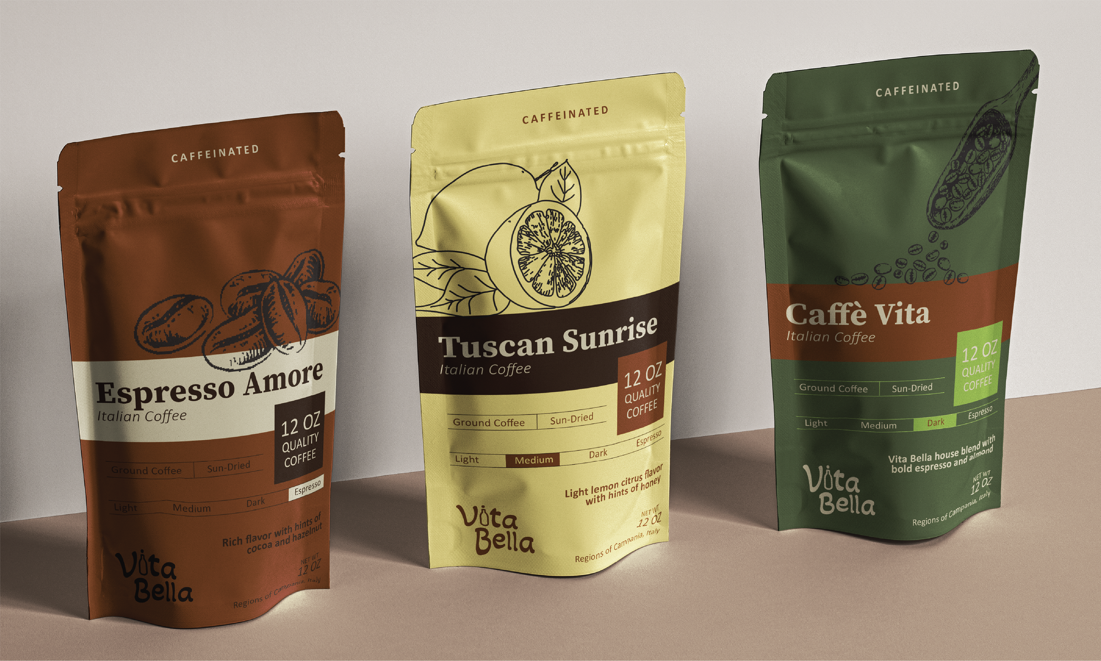
I designed packaging for coffee grounds that Vita Bella could potentially sell, either in the restaurant or through another store like Walmart or Hy-Vee. Here I really brought out the entire brand color palette, assigning each flavor its own color so customers can easily find the flavor they want and know the product is from Vita Bella.
I decided to take the drawn images from the business card and take it a step further, hand drawing large images to go with the different flavors. I came up with Italian names for each flavor and made sure to include the necessary information at the bottom, so customers know how much coffee is in each bag, the strength level of each flavor, and a general description of what each flavor tastes like.
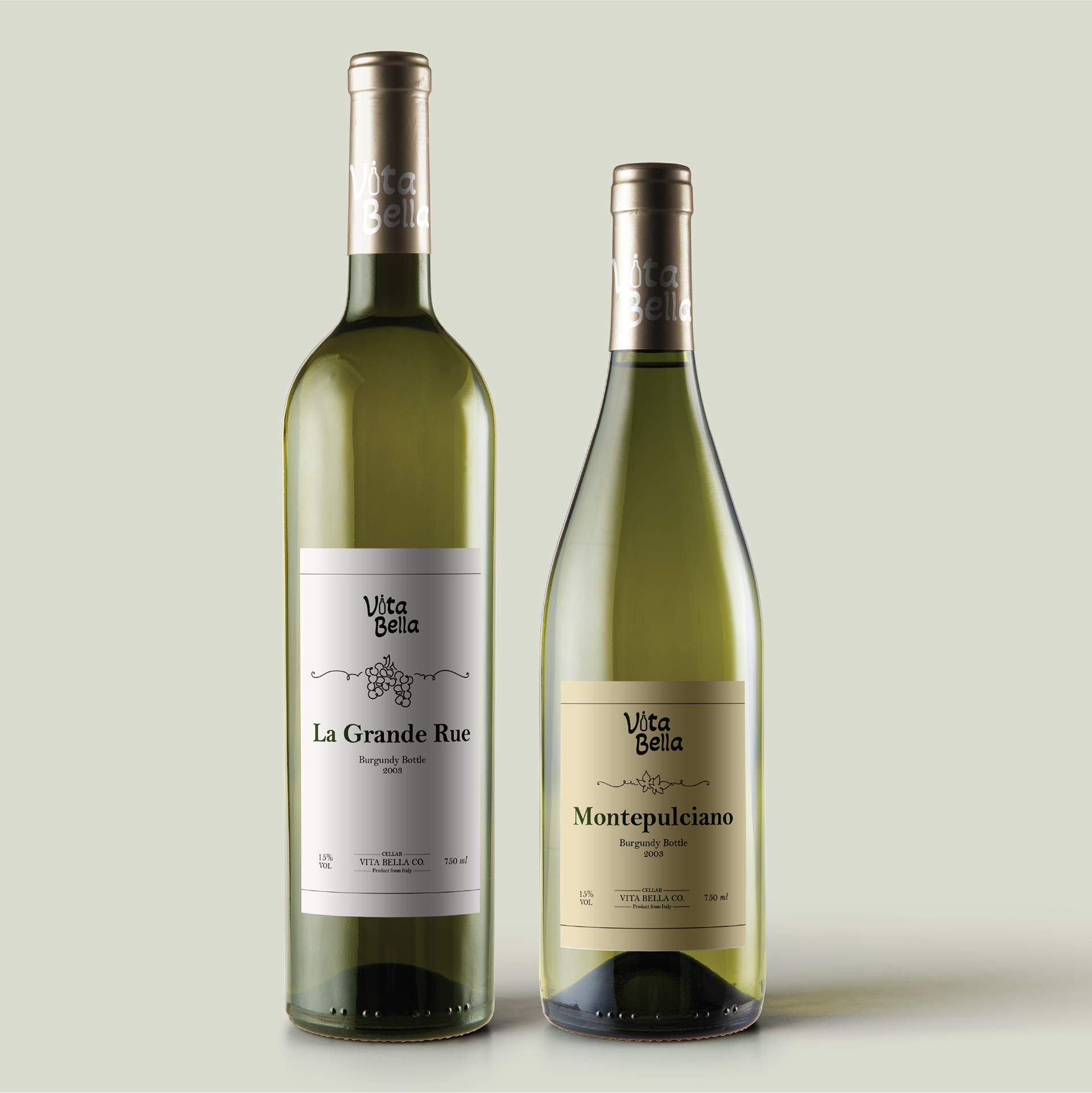
Here I expanded upon the idea of Vita Bella selling name brand food and designed wine bottle labels for wine that can be sold either in restaurant or elsewhere. I decided to go with a more clean approach to emphasize the aesthetic tone in Vita Bella's brand identity. To create unity between brand packaging I utilized the hand drawn imagery aspect, as well as brand colors and typography.