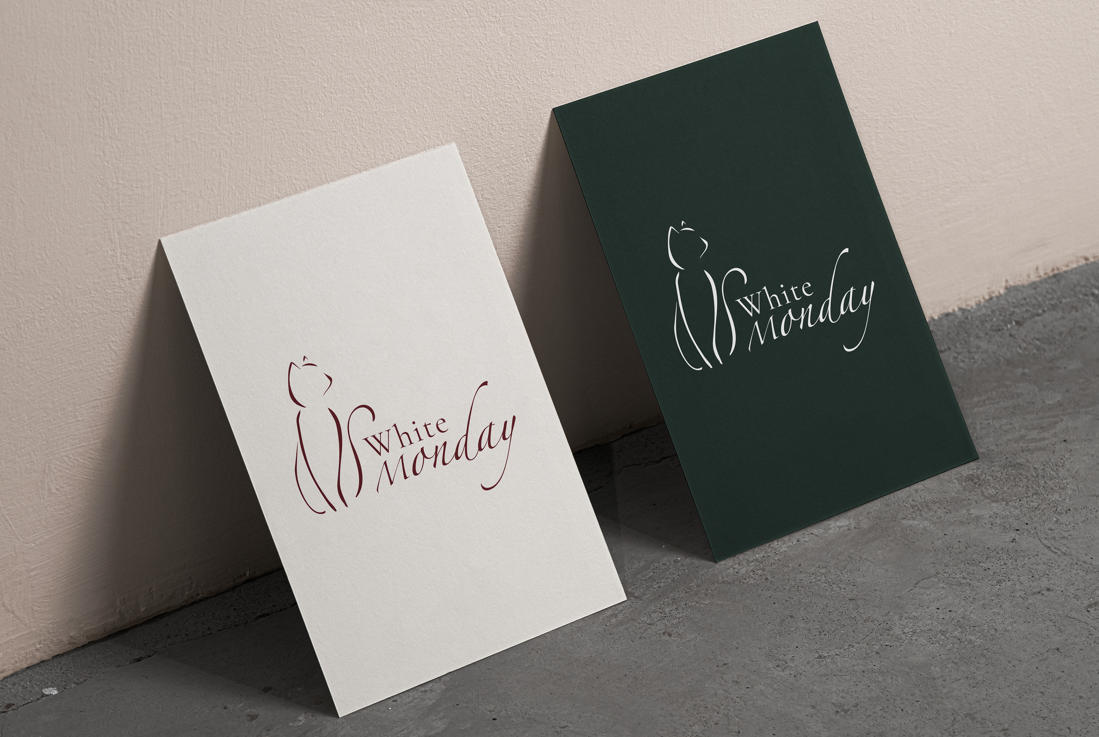
For this project I was tasked with creating the brand identity for a wine company called "White Monday." I was asked to create a sophisticated but simple logo to match the company's ideals, as well as a clean and simple color palette and icon. I put together this simple logo utilizing two type fonts to create character and depth to the piece. Next to it I came up with the outline of a cat posed in an elegant manner, with a line art style that is used throughout the entire brand identity. I then chose to do two logo variants: one using a cream background and wine-red logo, and another using a dark background and white logo. This allows variety in the usage of the logo while still maintaining the simplicity and sophistication of the brand.
I was also tasked with creating labels for the products of White Monday. I designed wine labels that match the brand identity while clearly communicating the vineyard, wine type, wine name, and more. I utilized the typefaces found in the logo to further create uniformity and cohesiveness within the label. To add depth and clarity, I used the head of the White Monday logo to clearly communicate the brand of the wine. The top of the bottle also applies this style. Just like the logo itself, I created two variants of the wine labels, which can be seen below. The idea was to create different versions to choose from depending on the bottle color and the flavor of wine being sold.


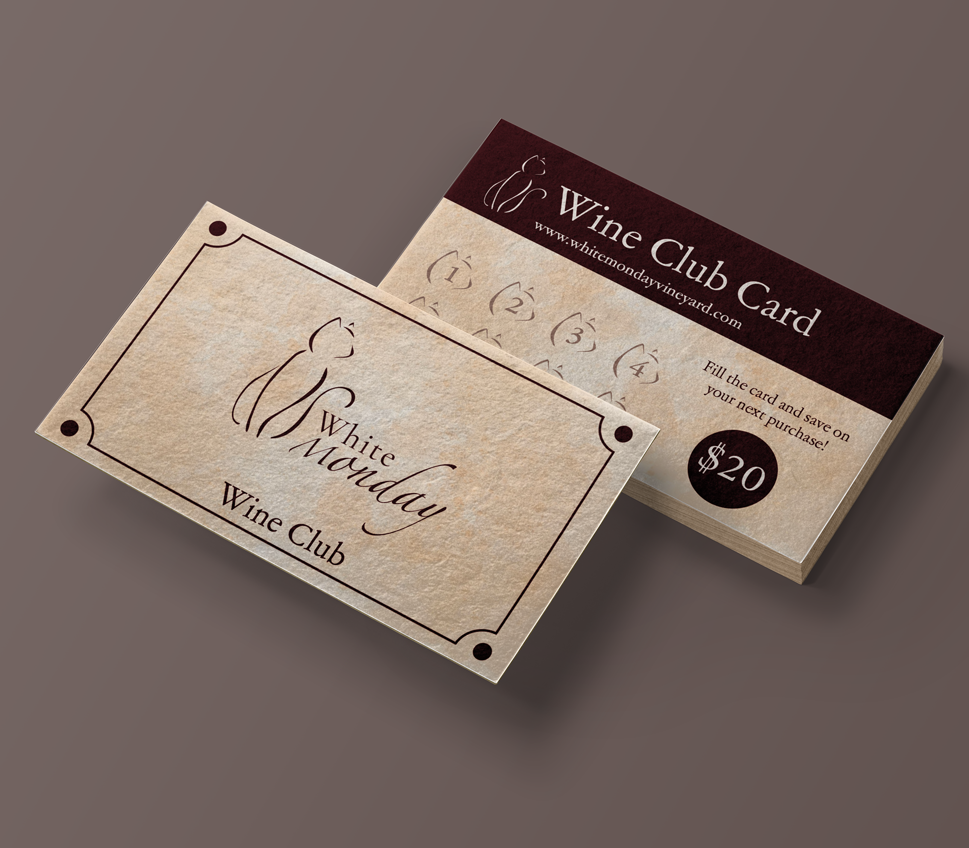
Along with wine bottle labels, I created wine club membership cards for customers who purchase on the regular. To match the simplicity of the logo, I decided to go with a cleaner and more straightforward look to the design. The front showcases the logo along with the intended purpose of the card, and the back shows available slots to be punched, along with the reward for getting all slots filled. I again used the head of the cat from the logo, this time using it as the slot shape itself. The entire card uses the cream and wine-red colors, furthering the brand identity.
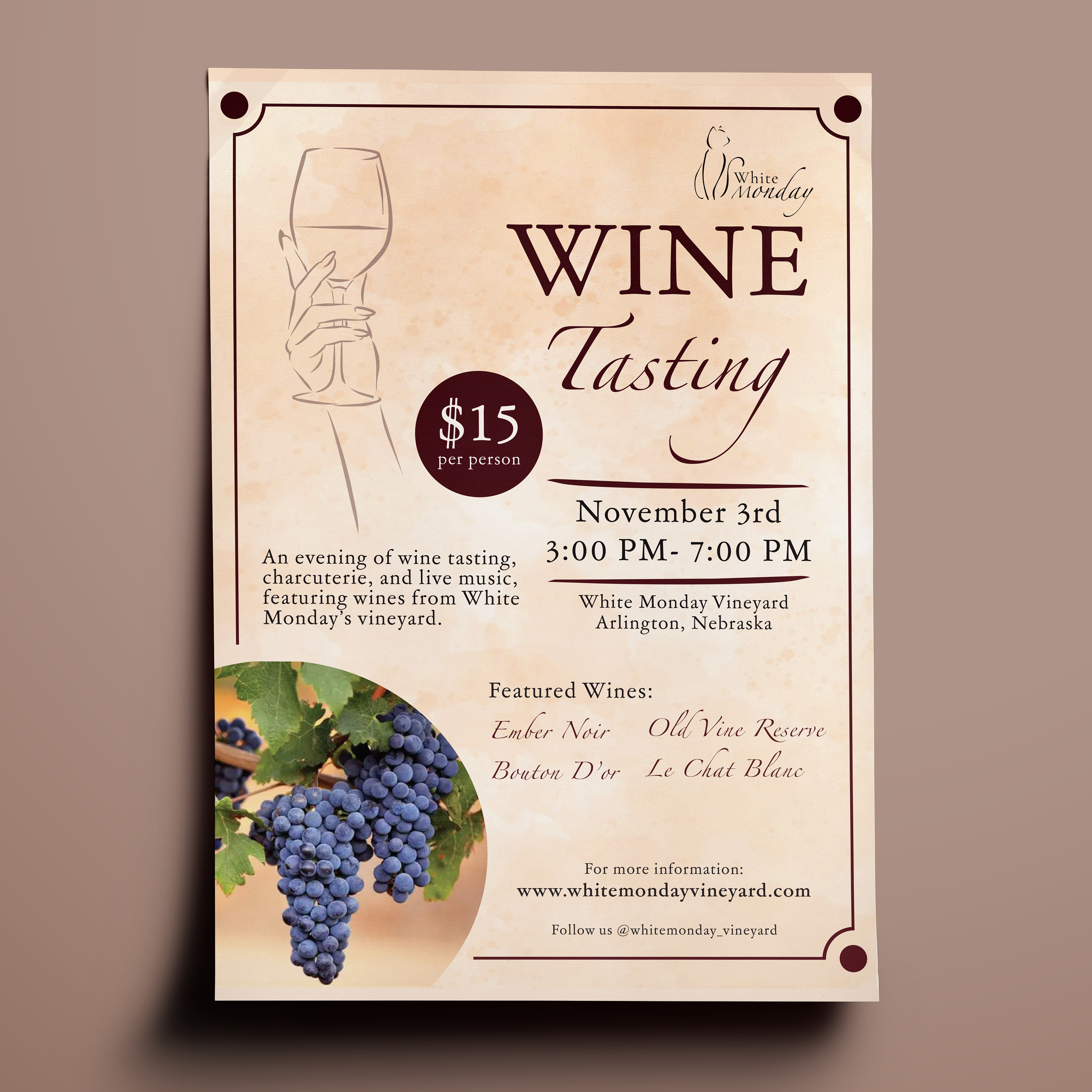
Besides selling products, White Monday also hosts wine tasting events. I was tasked with creating a promotional flyer for such event. I continued with the cream and wine red color to create uniformity and identity. I used the same typefaces from the logo to continue the brand standards, while also adding images and icons to further showcase the vineyard. On the left is an image of a hand holding a wine class, which was created in a similar line art style like the cat in the logo. The overall piece is simple and straight to the point, with a call-to-action at the bottom to help point interested parties in the right direction.