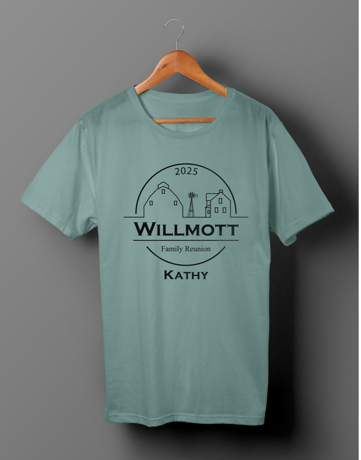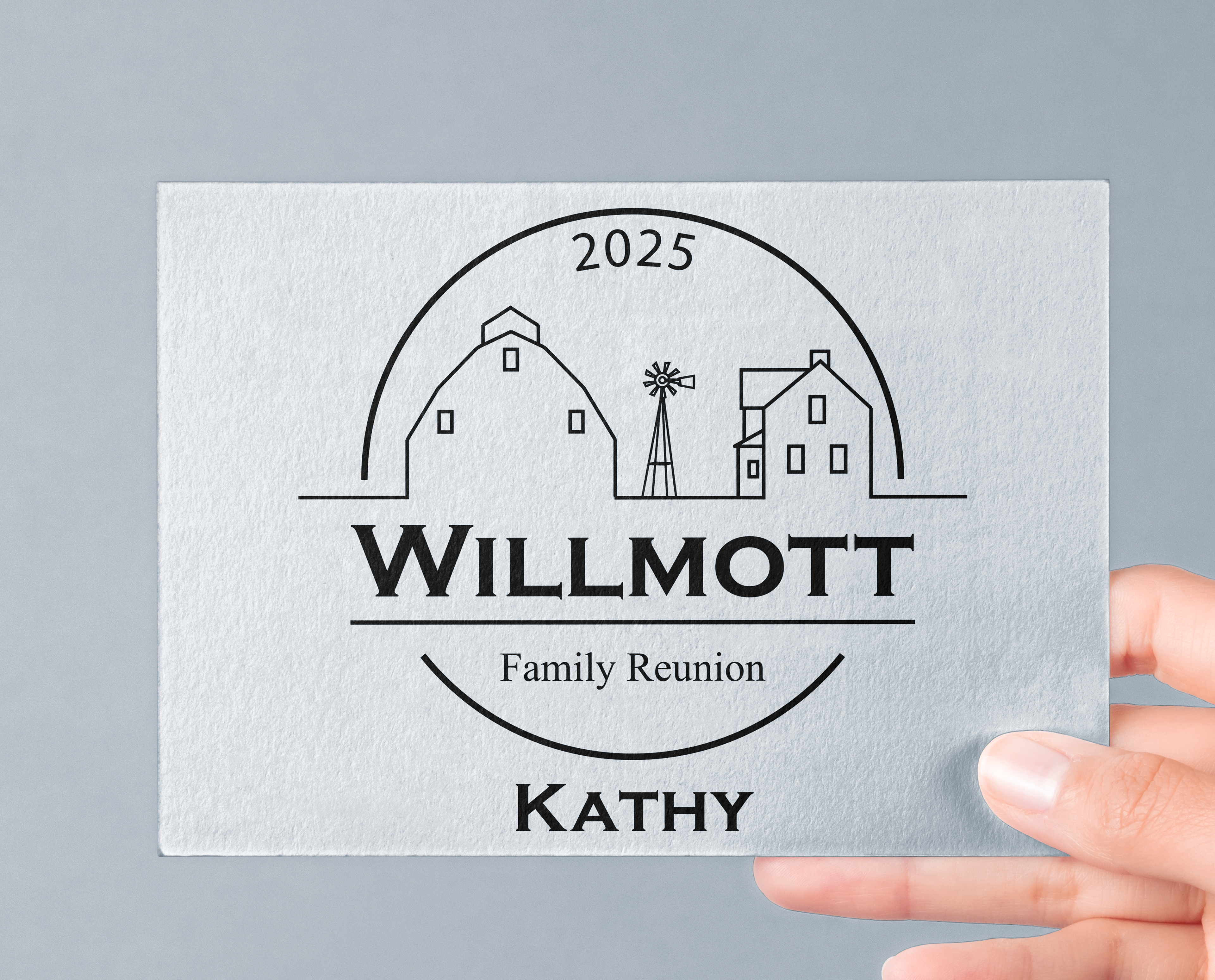
This project was a bit more personal for me. I was asked to design the logo for my family reunion. Since there are many members on this side of the family we felt it would be nice to have a logo to put on T-Shirts as well as the social media account. I decided on a simple, round logo for this project. The outline of the farm is reminiscent of the farm my ancestors grew up on. I was inspired by old photos taken of the house and barn, along with a windmill that stood in the background. Below that I made the family name prominent with a serif font. Underneath each logo would be the name of the sibling we were each related to from the original family. For this image I included the name "Kathy", which is the relative I am related to.
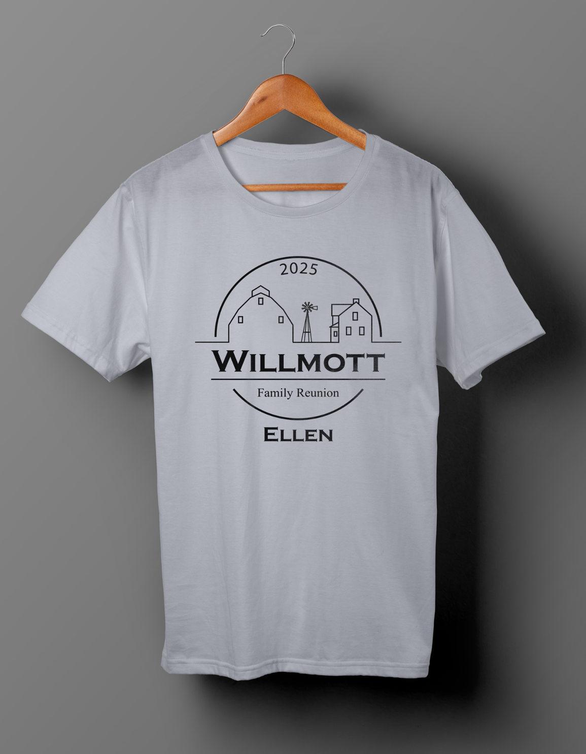
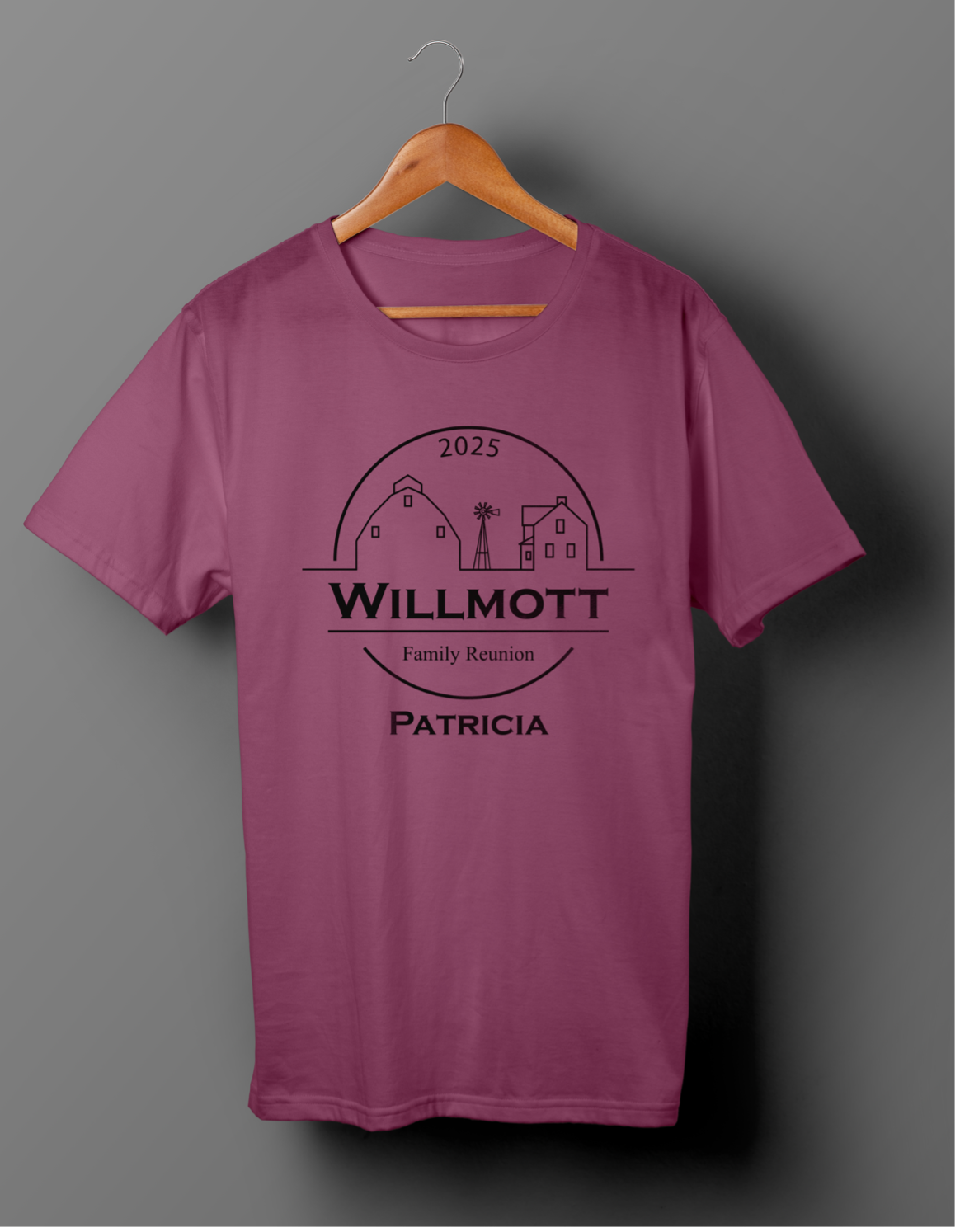
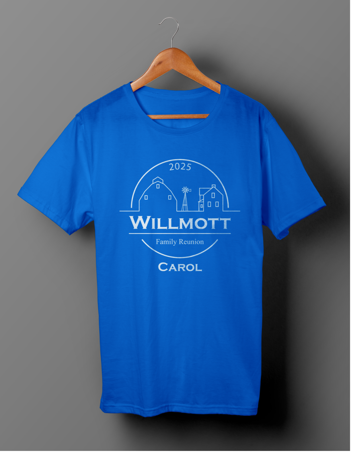
The main point of the logo was for T-Shirt designs. Here I showcase how the logo was printed on the shirts. Each logo has a different name underneath. Showing one of the eleven siblings from the original family. Each name also got its own color, so that during the reunion one could see the color you were wearing and know who you were related to. This was also a way to see how big each family had gotten over the years. The images on the right showcase a few names and colors that were used for the reunion. In total there were 11 variations of colors with different names.